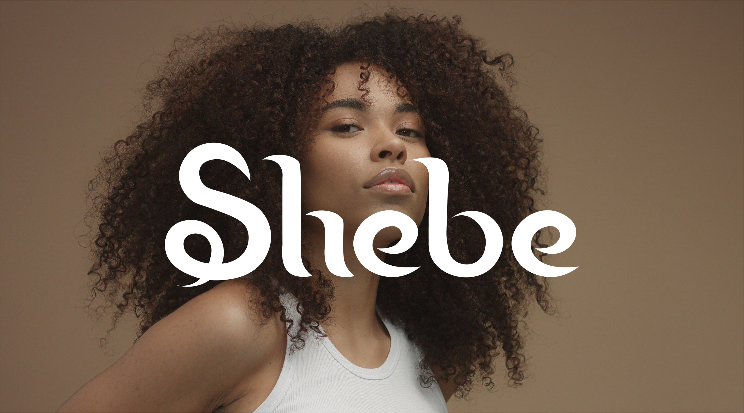
Shebe is a personal project born from the desire to craft a brand around hair — not just as a texture, but as a symbol of power, care, and transformation. Each letter in the logo was custom-designed to echo the shape and flow of a curl. The “S” also draws from the silhouette of a serpent, a subtle nod to rebirth, change, and shedding the old.
This identity was imagined as a visual manifesto the early DNA of a haircare brand still in development, but already rich in meaning.
This visual identity was created as a foundation for a future haircare brand rooted in meaning, texture, and ritual.